
Kindred
Project Overview
Enhancing the Alumni Engagement experience
Kindred is an AI based intake form that aims to reimagine the alumni engagement experience. It creates a seamless, engaging experience for alumni from various institutions while prioritizing these institutions' connection to the alumni database.
The Team
Layla Wrencher, Megan Liu, Rich Scott and Sanisha Agarwal (me!)
Project Role
Product Designer, Researcher, Animator
Tools
Figma, Figjam
Duration
3 weeks
Problem
Many alumni disengage from their universities due to impersonal outreach and uninspiring intake surveys, making it difficult for institutions to build authentic, long-term connections.
Solution
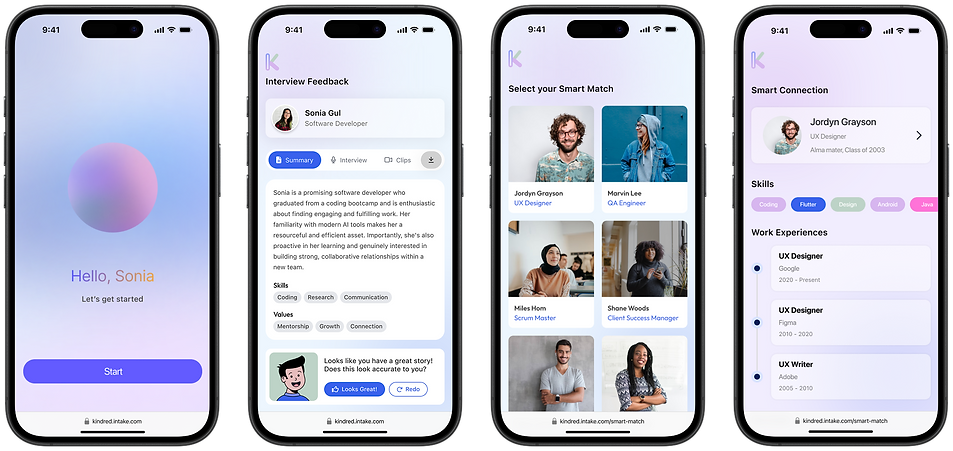
An engaging intake form experience that uses a conversational AI interface to help institutions match alumni with opportunities that actually matter to them.

What do alumni actually want?
Why aren't current efforts working?
Conducting Competitor Analysis and Exploratory User Research
We started with people. Alumni groups on Facebook, LinkedIn connections, and even AI chat features on Instagram and Snapchat became informal focus groups. We listened.
We also dove into tools already trying to tackle this space: PeopleGrove, Hivebrite, TalkHiring, and Protopia among others. Some leaned too formal, others felt impersonal, and none truly nailed the blend of authenticity and ease we were after.

platforms selected to explore and dissect

a detailed audit of existing platforms
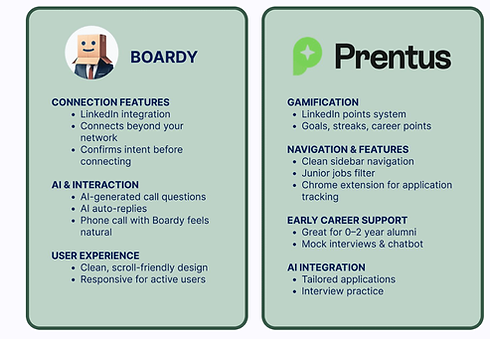
what works

what could be better
Listening to the frustrations and challenges first-hand
Then came the alumni side of things - we conducted a series of user interviews and collected survey responses. We wanted to hear directly from those who had either tried to engage and lost interest, or had avoided university outreach entirely.

Very quickly, we noticed trends start to occur. Across conversations, three major themes emerged:
Outreach feels generic
Emails and events often don’t match alumni’s interests, location, or career stage.
Networking is exhausting
Many felt that formal platforms and networking events came with pressure to impress rather than connect.
Alumni want guidance
There’s real interest in mentorship and giving back, but few clear paths for doing so.
Taking it all in
Enter: Sonia
From these themes, we developed a representative user: Sonia, a mid-20s alum who wants to grow professionally and connect with like-minded peers, but finds current networking options draining and impersonal. Sonia became the lens through which we evaluated every design choice.

“I want professional growth and authentic connections, but networking always feels performative and exhausting.”
Mapping out the user journey
In order to understand Sonia's journey at a deeper, emotional level, we mapped it her experience from being a member of an educational institution to interacting with Kindred.
Bootcamp Experience
Recent Graduate
Looking for
Career Advancement
Joins Kindred
Breaking Into
the Industry

We set out to design a conversational intake experience that felt authentic - more like a meaningful dialogue than a sterile data collection form. To bring this to life, we focused on two key areas that consistently emerged as top priorities in our user interviews.


task flow
From Ideation to Design
Design Decisions
Some design decisions we decided upon to support Sonia's pain points:
-
Conversational interface: We leaned into casual, chat-style interactions that allowed Sonia to respond quickly without the mental weight of a formal survey.
-
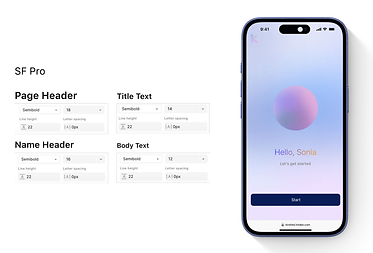
Subtle visual design: 6-column layout, clean spacing, and minimal distractions let the conversation take center stage.
-
Colors: A cohesive palette that leaned into the modern technology of AI while remaining approachable.


low to high fidelity wireframes


Testing the talk
Our usability testing focused on clarity, ease of use, and emotional tone. We needed to know: did this feel like a helpful conversation, or just another chatbot?

So... what's next?
Kindred is more than a tool - it’s a way to get alumni involved in a way that feels personal, meaningful, and engaging.
As a team, we're proud of the foundation we laid, and we see so much potential to grow through integrating deeper personalization, richer AI conversations, and ultimately, stronger alumni communities.