

Just Bake
Project Overview
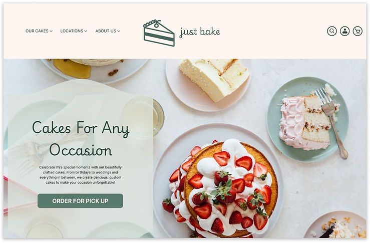
Refining and elevating the cake buying experience
Just Bake is a potential one stop shop that offers a wide range of flavors and multiple cake options for almost every occasion you can think of. However, the website's cluttered and overwhelming UI makes it difficult to find anything specific or personalized. In this project, I set out to polish the interface while making the user experience more enjoyable.
Project Role
UI/UX Designer, Researcher
Tools
Figma, Figjam
Duration
3 weeks

Research
Where does the problem lie, and what do the users want?
Dissecting the current search experience
An in-depth audit and analysis of the existing structure of the website

![FireShot Capture 014 - Alphanso Mango Cake - Just Bake - [www.justbake.in].png](https://static.wixstatic.com/media/37ee73_21f5c942311246819379dbbf420491cf~mv2.png/v1/fill/w_329,h_519,al_c,q_85,usm_0.66_1.00_0.01,enc_avif,quality_auto/FireShot%20Capture%20014%20-%20Alphanso%20Mango%20Cake%20-%20Just%20Bake%20-%20%5Bwww_justbake_in%5D.png)
original website
Discovering the root of the issues and what people prioritize
Usability Testing & Market Research
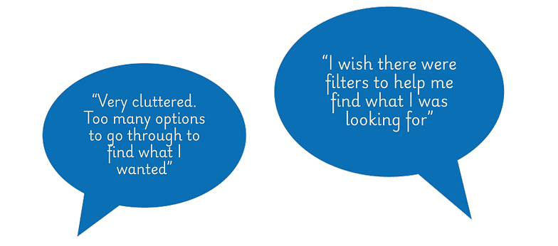
So how did I approach this? I conducted usability testing on the bakery’s existing website, by giving users the specific task of running through the website from the point of view of someone who would like to purchase a cake for a teenage boy’s birthday, till they got to the final check out page. The specificity of this prompt allowed me to visualize how easy it was for the user to find a specific cake for a specific occasion, not just any cake on the website. The users’ feedback unanimously reflected my assumptions of the page being too cluttered.
In order to determine what was successful at other bakeries, I conducted an in depth competitive and comparative analysis. I listed features in highly rated cake shops and bakeries that were not apparent in the Just Bake Website. I did the same with other dessert shops that could be indirect competitors, to see if there was something bakeries as a whole were missing.
User Interviews & Key Insights
Next, I interviewed four individuals about their cake ordering habits to gain insight on what they enjoyed/disliked about the process and what their priorities were. I was able to synthesize this information and narrow it down into 3 key priorities.
-
Website Design Preferences (People rely on website images)
-
Cake Customization (Cakes are usually purchased for friends and family)
-
Time Sensitive (Cakes are usually purchased for special occasions)

affinity mapping
I used this data to create the persona of Madeline. As an eldest sibling, startup founder and extroverted individual, Madeline has a lot on her plate. My goal was to support these lifestyle aspects by bringing something else to her plate - cake.
Honing in on my persona's needs, goals and pain points allowed me to narrow down the focus and identify the key problem statement.
Users need an easier way to order personalized specialty cakes, because they are overwhelmed with the number of options that they often need to go through in a limited amount of time

Defining and Structuring
How might we create a clean, approachable and navigational interface?
Information Architecture
In order to gain insight into how the average user might expect to see cakes categorized, I conducted card sorting with peers. I pulled names of cake flavors from Just Bake's original website and pasted them onto individual post it notes for my users to sort. Incorporating a majority-intuition sorting method in my information architecture would ensure a swifter search pipeline for the user.


This information informed my process of building a sitemap, where I categorized the products offered across the website according to my findings.
Ideation & Branding
Once I had a framework to work with, I used my research as a backbone to map out the visuals of this redesign. I started with a series of sketches to explore layout and aesthetic.


logo exploration

original branding

updated branding
