COLOR TOKENS
Aa
text/display/sm
Global HealthX
Design System
CASE STUDY
DESIGN SYSTEMS
GLOBAL HEALTHX
Design System
Building a scalable design system to support multiple products across Global HealthX
ROLE
Product Design
TEAM
TIMELINE
6 months
SCOPE
THE PROBLEM
The problem with what we already had
At a fast-paced startup where priorities are constantly evolving, new projects come up on an almost daily basis. One thing stayed consistent: Each product had evolved independently, creating inconsistent patterns, duplicated design work, and components that were difficult to reuse. As we redesigned the therapist platform, we used the opportunity to build a shared foundation.
01
The system was fragmented, incomplete and outdated
02
Screens showed UI inconsistencies, even within a single platform
03
No shared foundation existed for future products
KEY DECISIONS
Our approach
Started with a foundation
We used Untitled UI as a base, then adapted its structure, tokens, and patterns around our product needs.
Built around real product needs
We built the components needed right away for the therapist platform, but designed them so they would hold up across future products.
Built alongside engineers
Components, tokens and documentation were produced with engineers rather than handed to them, which meant far less friction at implementation.
↑ Featured icon / md / brand-secondary / light
03 — WHAT WE BUILT
What we built
01
Tokens
A tiered token system built as local Figma variables across typography, spacing, color and layout, structured around atomic design principles.
COLOR / TIER 2 — SEMANTIC, ALIASED TO TIER 1
color/background/primary
#207D82
color/background/utility/error
#B91C1C
color/background/utility/success
#158040
color/background/utility/info
#0369A1
color/neutral/600
#6B7280
TYPOGRAPHY / FIGMA TEXT STYLES
Section heading
Body copy at rest
Supporting detail
SPACING / TIER 1 PRIMITIVES · RADIUS
4
8
12
16
24
32
48
sm 4
md 8
lg 12
→ RESOLVED IN A COMPONENT
Save changes
olivia@untitledui.com
bg ← color/background/primary
radius ← border/radius/md · 8
padding ← spacing/2 · spacing/4
label ← text/body/md semibold
focus ← color/border/brand @ 24%
02
Components
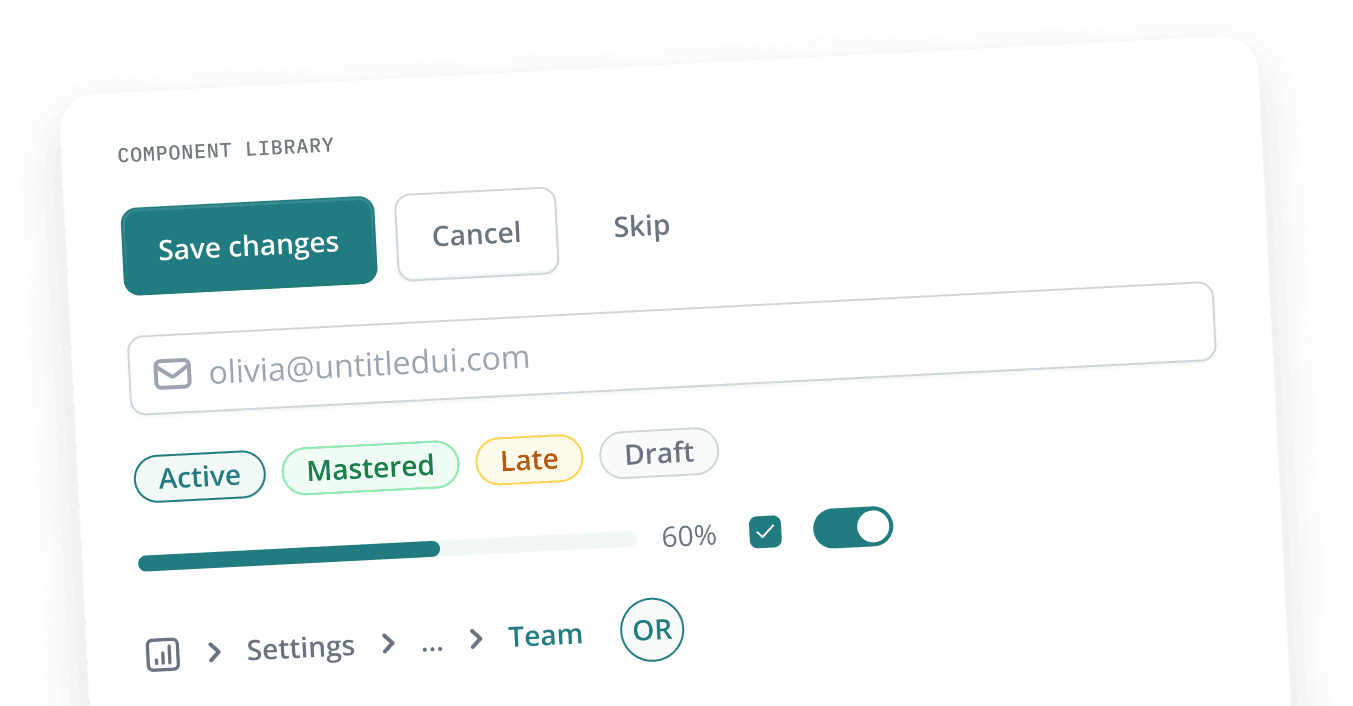
A library of 20+ components with carefully considered variants and states — buttons, input fields, breadcrumbs, tabs, tags, progress bars, notifications and more.
Actions
Inputs
Feedback
Navigation
Data display
Overlays
Horizontal tabs / Button border / Desktop
Save changes
Cancel
Skip
Button / Primary · Secondary · Tertiary / sm
Active
Mastered
Late
New
5
Badge / md — Brand · Success · Error + Tag
olivia@untitledui.com
Input field / sm / Placeholder
Settings
...
Team
Breadcrumbs · Checkbox · Radio · Toggle
03
Copy guidelines
Alongside the visual components, I wrote copy guidelines into the system, so tone, clarity and wording stayed consistent across the product.
01 · NUMBERS IN UI COPY
Input field / sm / Filled
Skills selected
Numerals read faster in a dense table.
Skills selected
Four skills selected
Words slow the scan and sit oddly next to data.
02 · BUTTON LABELS
Button / md / Primary · Tertiary
Save changes
Cancel
The label names the outcome.
Submit
Cancel
Generic labels make people re-read the form.
03 · WHEN SOMETHING GOES WRONG
Information Bar / Error / Desktop
We couldn’t save your notes. Try again in a moment.
Says what happened, then what to do.
Error 4302: request failed.
A code tells you it broke, not what to do.
04 — BEYOND THE DESIGN
Making the system usable beyond Figma
We worked closely with engineers to extend our ownership past design, into how the system actually behaved in practice.
Documentation
We documented component states, usage rules, and patterns so the system could be used consistently.
Workflow
We tracked components from design through development so both teams knew what was ready to use.
SAMPLE OF OUR COMPONENT HANDOFF SHEET, REDRAWN IN THE SYSTEM’S OWN TABLE
Component
Status
What changed from the base kit
Comments
Breadcrumbs
Developed
Removed the divider — chevron only
Property removed after it was already built; remapped some tokens
Dropdown
In progress
Removed size, supporting text and shortcut. Added x-close for Search + Tags
Renamed from “Select” to follow our naming conventions
Badge
Ready for dev
Removed icon trailing swap and flag swap. Added “Disabled” color
—
Progress stepper
In progress
Added a “Steps” property
↳ Progress step is a custom component, not from Untitled UI
↑ Table header cell / sm · Table cell / Text · Badge — status colors are live Badge variants, not swatches. A second sheet tracked every token change by tier and date.
05 — OUTCOMES
The Impact
Faster feature delivery
Reusable patterns reduced repeated decisions across new features.
Consistency across products
Shared components and conventions created a common product language.
Adopted beyond the original platform
The system expanded beyond Plan & Track to support other CognitiveBotics products.
Checkbox / Checked / Supporting text — the outcomes, ticked off in the system’s own component
06 — REFLECTIONS
My takeaways
Designing beyond screens
This project moved me from designing individual screens to thinking in systems - patterns, scalability, and what still holds up in a year.
Collaborating with engineers
Building together surfaced constraints early and reduced rework.
Design systems keep evolving
Components and rules continued evolving with new product needs.
Sanisha Agarwal
powered by a lot of sunshine and strawberry matcha
© 2026 Sanisha Agarwal