
CASE STUDY
PRODUCT DESIGN
SHIPPED
CognitiveBotics: Plan and Track
Simplifying clinical workflows for therapists supporting children with autism and other learning disabilities. What began as a visual redesign evolved into a complete rethink of the product's structure and workflows.
ROLE
Product Design
TEAM
2 Designers,
Product, Engineering, 1 BCBA
TIMELINE
12 months
SKILLS
Information architecture
Interaction design
Design systems


AT A GLANCE
Therapist platform
Redesigned core workflows spanning onboarding, care planning, sessions, reporting, and adaptive recommendations.
Cross-platform design system
Built alongside the product and adopted across multiple web and mobile experiences.
CONTEXT
The workflow was familiar, but getting around it wasn't
Plan and Track already supported the therapist’s workflow, but years of features being added on had made the product harder to navigate. Related information lived in different places, and many day-to-day processes were still happening on paper.
I expected to update the interface to reflect the new brand. That turned out to be the smallest problem. The bigger opportunity was restructuring the product around how therapists actually worked, without disrupting a workflow they already understood.

How might we organise the platform around how therapists work, rather than around a list of features?
DECISION MAKING
We had a BCBA on the team who worked directly with therapists and children, so I could check decisions with someone who knew the clinical workflow. I also worked closely with the senior designer who built the first version and understood why earlier decisions had been made.
Direct access to specialist therapists across India was limited, so not every decision could be validated before shipping. When we had to make a call, I kept coming back to three principles:
1
Reduce cognitive load
Help therapists focus on the task, not navigating the software
2
Support clinical judgement
Provide guidance without making decisions on the therapist’s behalf
3
Think beyond the screen
Design around what brought therapists here and what they need to do next
WHERE WE STARTED
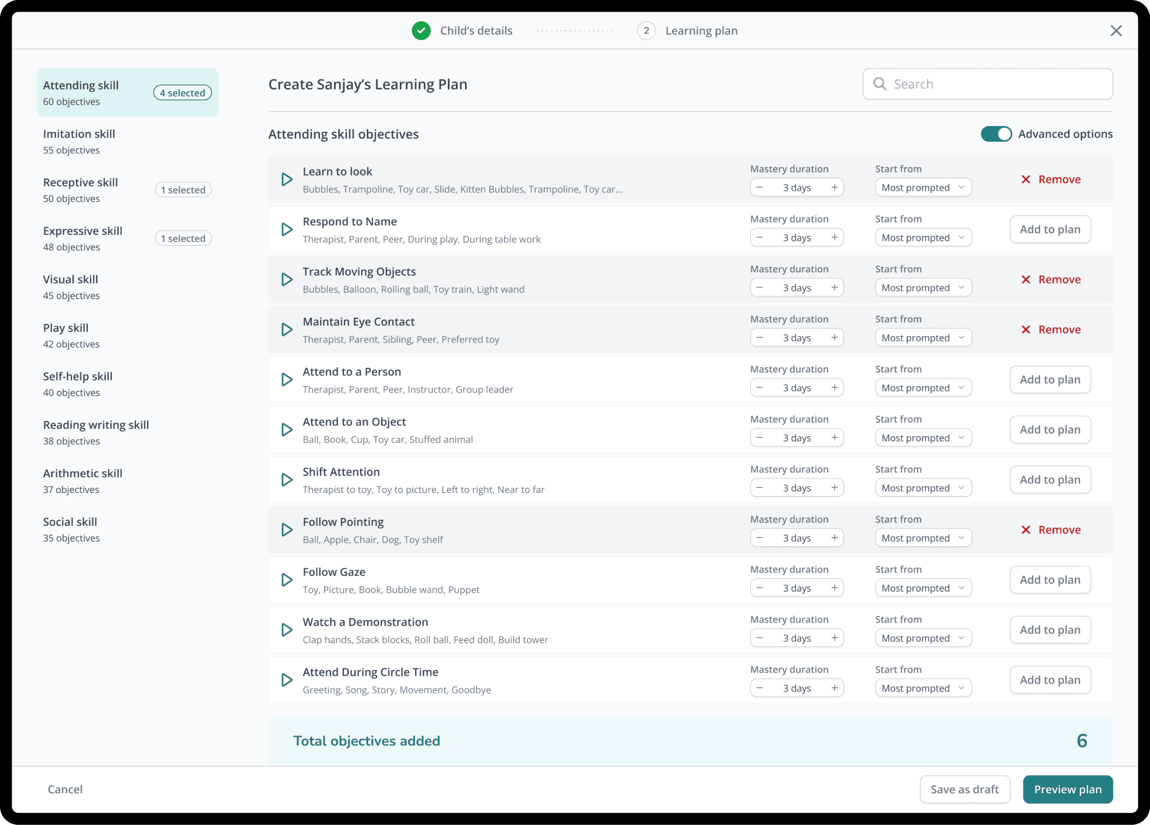
Condensing 450+ objectives into a clear learning plan
We started with Child Onboarding because almost every other workflow depended on it. Assessments, learning plans, recommendations, sessions, and reports all stem from decisions made here.
The original experience put everything on a single screen and relied on therapists already knowing what came next. That might work for experienced users, but we were also designing for centres in India where therapists often had varying levels of experience and needed more support from the product itself. We reorganised the flow around the order those decisions naturally happen. The decisions didn’t get simpler. They just stopped arriving all at once.


INFORMATION ARCHITECTURE
Helping the therapist get to where they want to go
Once Child Onboarding was working, we applied the same thinking across the rest of the platform.
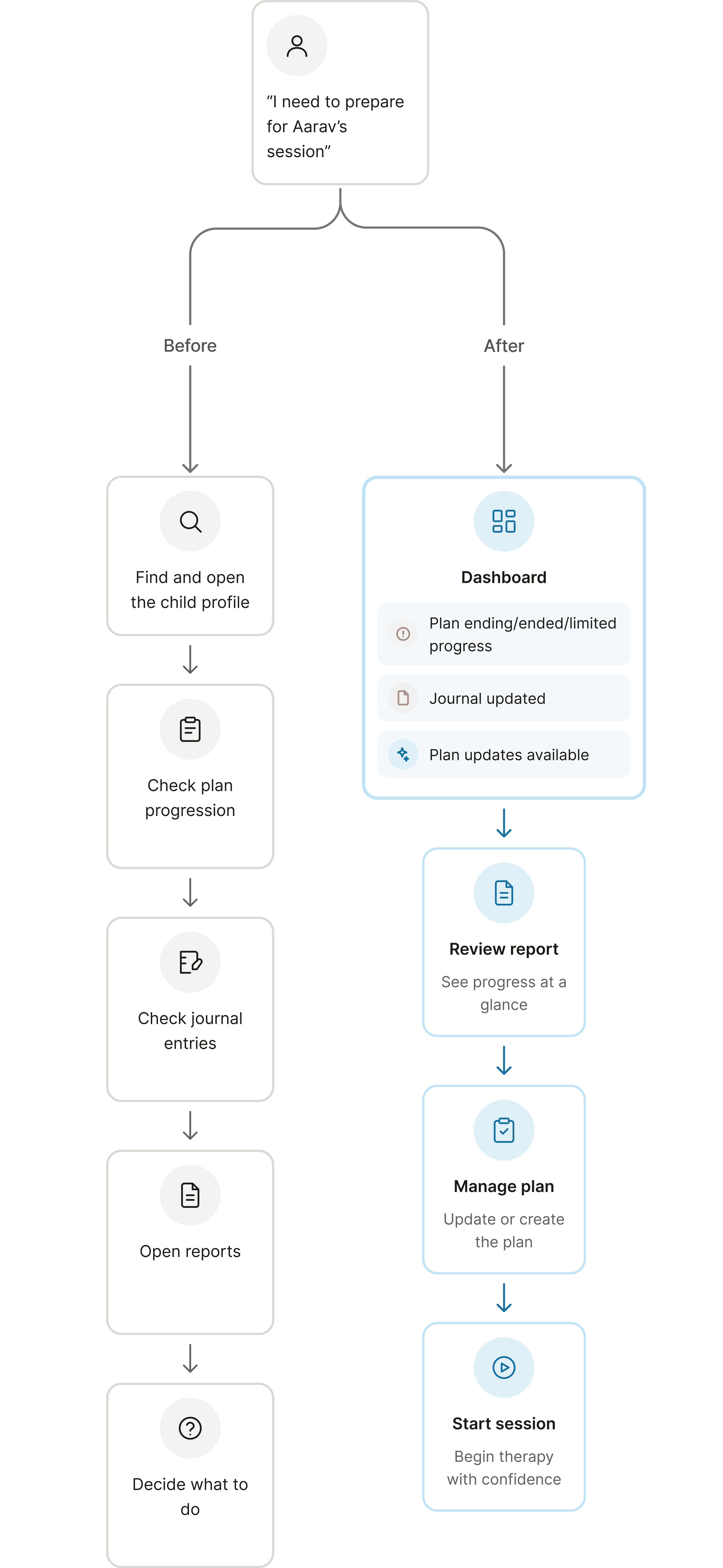
Therapists don't think, "I need to go to Reports." They're thinking, "I need to prepare for Aarav's session." We reorganised the experience around that workflow.
Hunting for information in several places → One clear next step in one place
Deciding what not to show
The previous dashboard gave therapists a snapshot of the platform: charts, counts, appointments, and activity. Some of the information was useful, but it didn't answer the one question therapists asked when they logged in:
“What do I need to work on today?”
The redesign shifted the dashboard from monitoring the platform to supporting the therapist's workflow. Instead of asking therapists to open each child's profile to understand what had changed, we surfaced the information that required action directly on the dashboard.
Children who were progressing normally became much quieter in the interface, making it easier to focus on the work that actually required attention.

Old platform dashboard

Revamped platform dashboard
A DECISION I REVERSED
Changing course

ORIGINAL WIREFRAME

WHAT WE BUILT INSTEAD
SCALING
Owning the product beyond the redesign
After the redesign shipped, I became the main designer for new features. Over time, we extended the platform using the workflows and components we had already established.

Adaptive Updates & Suggestions
AI-driven changes and recommendations that support clinical judgment
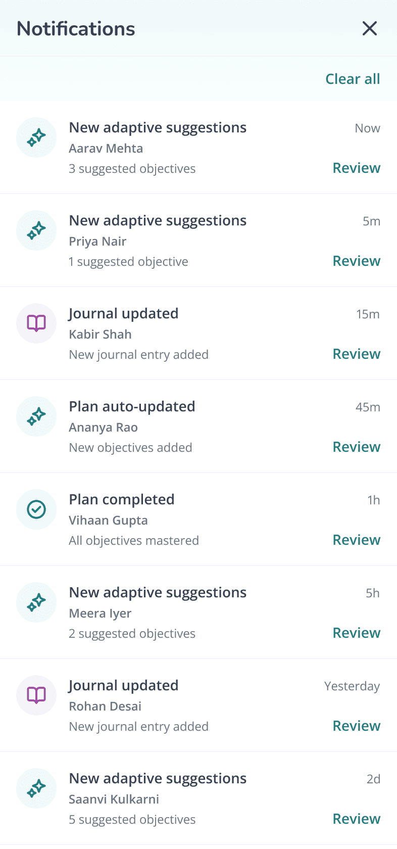
Notifications
Bring important updates to therapists instead of making them search


Desktop → Mobile Sessions
Transition from planning to therapy without losing context

Download Detailed Reports
Dense clinical data designed to be scanned quickly

OUTCOMES
Where we are today
Everything has shipped, but it’s still too early for usage numbers I’d consider meaningful. These are the outcomes we’ve already seen internally.
A product therapists can learn
The platform now supports therapists through consistent workflows instead of relying on prior product knowledge.
Built to evolve
Established patterns helped design and engineering ship new features without rebuilding workflows from scratch.
Faster product delivery
Shared components, interaction patterns, and clearer workflows reduced design and engineering effort as the platform continued to grow.
REFLECTION
What I’d do differently
Cleaner isn’t automatically better
Reducing clutter improved usability, but early feedback from therapists in India showed that clarity alone could still feel visually flat. I’d balance simplicity with more warmth and personality.
Validate the workflow before the UI
I’d spend more time testing the structure, terminology, and onboarding across different centres before refining the interface.
Don’t start with the screen
I now spend more time understanding what happens before and after a screen before deciding what belongs on it.
Sanisha Agarwal
powered by a lot of sunshine and strawberry matcha
© 2026 Sanisha Agarwal